Sfoglia categorie
Esplora
Fiverr Pro
Italiano
$
USD
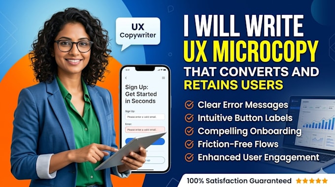
I Fix AI Generated Code So You Can Ship
Your app is confusing users. They tap buttons and guess what happens. Signups stall. Churn climbs. The problem isn't your features, it's your words.
I write ux microcopy for apps that guides users without thinking. Every button label, every error message, every onboarding screen earns its place. My app microcopy writing turns "Submit" into "Get Started" and "Error 404" into "Let's find what you need".
This isn't decoration. Conversion focused microcopy moves metrics. I've watched apps double signups just by fixing their welcome flow. Watched support tickets drop 40% with clearer error states. Small words, big impact.
Your mobile app ux writing should feel invisible, users flow from screen to screen without friction. I make that happen. From push notifications that get opened to empty states that engage, every word pulls weight.
Stop losing users to confusion.
Order now and give your app the voice it deserves.

Piattaforma:
Sito web
•
App mobile
Lingua:
Arabo
•
Inglese
Informa il freelance di eventuali preferenze o preoccupazioni relative all'uso di strumenti di IA nel completamento e/o nella consegna dell'ordine.
What's the difference between UX microcopy and regular copywriting?
UX microcopy guides users through tasks inside your app, buttons, error messages, onboarding. Copywriting sells your product externally. I focus on ux microcopy for apps that reduces friction and increases task completion, not marketing fluff
Our app is already built. Can you fix the copy now or is it too late?
It's never too late, but earlier is better. I can audit existing app microcopy writing and fix confusing labels, vague errors, and inconsistent tone. However, retrofitting costs more than designing copy alongside UI. For new features, bring me in during wireframing.
How do you write error messages that don't frustrate users?
I follow the three-part pattern: [What failed] + [Why] + [What to do]. Instead of "Error 404," I write "Page not found. The link may be broken. Try searching or go back home." This conversion focused microcopy reduces support tickets and keeps users moving.
Can you make our app sound professional but still friendly?
Yes. I create voice and tone design guidelines that balance your brand personality with clarity. A fintech app needs different microcopy than a fitness app. I match mobile app ux writing to your user's emotional state—calm for banking, energetic for workouts
How do you measure if UX microcopy is actually working?
I track task completion rates, time on task, error rates, and support ticket volume. Good ux microcopy for apps makes users succeed without noticing the words. If completion rates rise and confusion drops, the copy is working .
We have a global app. Can you write for multiple languages?
: I write source app microcopy writing in English optimized for translation. Short, clear sentences translate better than clever idioms. I can also collaborate with your localization team to ensure conversion focused microcopy maintains clarity across cultures.
How is UX microcopy different from marketing copy we already have?
Marketing copy persuades people to download. Mobile app ux writing helps them succeed once inside. Your homepage sells. Your app guides. I bridge that gap so users don't feel baited-and-switched by confusing post-download experiences.
