Sembra che questo servizio sia in sospeso

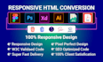
I will design a mobile responsive website in HTML, CSS, bootstrap, and javascript

R
russel1980
R
russel1980
Muhammad S
Alcune informazioni sono riportate in lingua inglese.

Informazioni su questo servizio

Hi,

I'm a professional front-end developer.


Do you need to convert PSD to HTML, XD to HTML, Figma to HTML responsive website?

I can do this fast and efficiently. I have 8 + years of experience and did 500+ projects.


My Services:


  • PSD to HTML
  • XD to HTML
  • Figma to HTML
  • Ai to HTML
  • Zeplin to HTML
  • Sketch to HTML
  • Invision to HTML
  • PDF to HTML
  • Or any kind of images to HTML


You will get:


  • HTML5/CSS3 Pixel perfect Markup
  • Mobile-friendly responsive design
  • Cross-browser compatibility 
  • SEO optimized code
  • Regular work update
  • W3c validated + much more ...


Why should you hire me?


  • High-quality work
  • Fast communication
  • Super fast delivery
  • Unlimited revision until you are satisfied
  • 24/7 Customer Support


NOTE: Cost and time depend on the page content. So please message me before placing an order to make a perfect deal.


Thank you so much for visiting my gig.


Rispettare i diritti di terzi

Ricorda che è contrario alle politiche di Fiverr per i freelance includere temi, modelli o qualsiasi altro elemento che violi i diritti di terzi o le leggi applicabili nell'opera consegnata. Per saperne di più, consulta Guida alla creazione digitale responsabile.

Scopri di più su Muhammad S

Muhammad S
  • DaBangladesh
  • Membro damar 2020
  • Lingue

    Spagnolo, Arabo, Hindi, Inglese
As a front-end web development expert with over 8 years of experience, I offer professional web development services with a focus on responsive design using Bootstrap. I specialize in creating beautiful and user-friendly websites that work seamlessly across all devices. With this gig, I will develop a custom front-end for your website using Bootstrap, the most popular front-end development framework. I will create a responsive design that adapts to different screen sizes, ensuring a consistent user experience on desktop, tablet, and mobile devices.